

CSS foundations come down to a handful of ideas: selectors that target your HTML, the box model that controls spacing, flexible units like percentages and rem, and media queries that adjust your layout for different screens. Learn those four and you can style a page that looks good on a phone, a tablet, and a desktop. Most beginners can work through the basics in an afternoon, and all you need is a text editor and a web browser.
Why does this combination work so well? Because responsive design isn’t about memorizing dozens of tricks. It’s about letting your page bend instead of break. Instead of fixing a box at 600 pixels wide, you tell it to take up 90 percent of the screen, and it fits every device without extra effort.
Here’s a tiny example. This one line keeps images from spilling off small screens:
img { max-width: 100%; }
That’s it. One rule, and your pictures shrink politely to fit.
In this guide, you’ll build up your skills one small step at a time, with simple examples you can copy, tweak, and test yourself. No prior coding knowledge is needed, and every technical term gets a plain-English explanation. Ready to make a page that looks great everywhere? Let’s get started.
What You Need Before You Start Styling

Setting Up Your Starter Files
Let’s set up two tiny files. Make a folder, then create one file called index.html and another called styles.css. If you’ve built a first webpage before, this will feel familiar.
Here’s the HTML to paste into index.html:
“`html
My Practice Page
Hello, CSS!
This is my first styled page.
“`
Here’s what the important lines do, in plain words:
– The charset line tells the browser how to read letters and symbols, so text shows up correctly.
– The viewport line tells phones to match the page to the screen’s real width instead of pretending to be a big desktop.
– The link line connects your page to styles.css, so any CSS you write there changes how the page looks.
The viewport line is the one beginners skip, and it matters most for responsive design. Without it, many phones shrink your whole page down like a tiny poster, and your layout rules never get a fair chance. The viewport meta controls scaling on mobile browsers, which is why it earns a spot in every page you build from here on.
Leave styles.css empty for now. We’ll fill it up one small step at a time.
Friendly Reminders Before You Dive In
Before you start styling, a few friendly habits will save you a lot of head-scratching later. None of this is scary, and every web designer has broken a page at least once. It’s simply part of learning.
First, keep a spare copy of your work. Even a simple “my-site-backup” folder on your desktop is enough. If your site lives on WordPress or another platform, take a minute to back up your site before you experiment, so you can always return to a version that worked.
Second, change one thing at a time. If you adjust five rules and the page suddenly looks odd, you won’t know which one caused it. Make a small edit, save, refresh the browser, and look. That tiny rhythm makes problems easy to spot.
Third, go easy on fixed pixel widths. A box set to 900px looks great on a laptop, but it spills off the edge of a phone. We’ll use flexible sizes instead, so your layout can stretch and shrink gracefully.
When a page stops behaving, pause and right-click the element, then choose “Inspect.” It shows exactly which styles apply, and it’s a great way to learn.
How to Build Your CSS Foundations, One Step at a Time
Step 1: Pick What to Style with Selectors
Think of your web page as a big apartment building. Before you can paint a room, you have to say which room you mean. That’s all a selector does: it points at the part of your page you want to style.
There are three kinds to learn first.
Element selectors target every tag of one type. It’s like saying, “Paint every kitchen in the building.”
“`css
h1 {
color: darkblue;
}
“`
Class selectors target anything you’ve labeled with a class name. They start with a dot. It’s like saying, “Paint every door with a blue sticker.” You can reuse a class as many times as you like.
“`css
.intro {
color: gray;
}
“`
ID selectors target one single item. They start with a hash symbol. It’s like saying, “Paint apartment 4B.” An ID should only appear once per page.
“`css
#main-title {
font-size: 2rem;
}
“`
Here’s how they work together. Say your HTML has a heading and a paragraph:
“`html
Welcome to My Shop
We sell handmade candles.
“`
The CSS above styles the heading by its ID and the paragraph by its class, and both changes show up as soon as you refresh your browser.
A good habit while you’re learning: reach for classes most of the time. They’re flexible, easy to reuse, and they keep your styles tidy as your page grows. Save IDs for those rare “one of a kind” moments.
Try changing a color or two and watching what happens. That quick feedback is how selectors start to feel natural.
Step 2: Add Color, Fonts, and Spacing
Now that you can pick what to style, let’s make your page look like something. Color, fonts, and spacing are the quickest way to see a real change in the browser.
Add this to your stylesheet:
“`css
body {
background-color: #f7f4ef;
color: #333333;
font-family: Arial, Helvetica, sans-serif;
font-size: 18px;
}
h1 {
color: #1a5f7a;
font-size: 2rem;
}
“`
Here’s what each line does. `background-color` paints the page behind your content. `color` changes the text itself. `font-family` picks the typeface, and the extra names after the first are backups in case a visitor’s device doesn’t have it. `font-size` sets how big the text is.
Colors can be written as names (like `navy`) or as hex codes (like `#1a5f7a`). Hex codes give you way more shades, and your browser’s color picker can generate them for you.
You may have noticed `2rem` in the heading rule. That’s a flexible unit, and we’ll look at it properly in Step 4. For now, just know it scales nicely on different screens.
Save the file, refresh your browser, and watch the page change. Try swapping a color or two. Mixing things up is the best way to learn what each property does.
Step 3: Understand the Box Model (Content, Padding, Border, Margin)
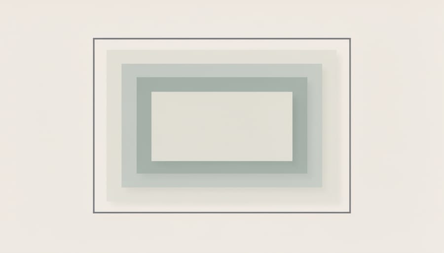
Every element on a web page is a box, and the box model describes the layers wrapped around it. Think of a gift box. The gift itself is your contentthe text or image inside. The tissue paper cushioning it is paddingthe breathing room between the gift and the box walls. The cardboard box is the border. The empty space between this box and the next one on the shelf is the margin.
Padding and margin are the two that confuse people, so here’s the simple difference. Padding sits inside the border and pushes the content away from the edges. Margin sits outside the border and pushes other elements away.
“`css
.card {
padding: 20px;
border: 2px solid #333;
margin: 30px;
}
“`
Here, the text has 20px of cushioning, the border wraps around it, and 30px of space separates the card from its neighbors. Padding also shows the element’s background color, while margin is always transparent.
Now for a surprise that trips up almost every beginner. By default, padding and border get added to an element’s width. A box set to `width: 300px` with 20px of padding on each side ends up 340px wide. That can quietly break a layout on a small screen.
The fix is one friendly habit. Add this at the top of your stylesheet:
“`css
* {
box-sizing: border-box;
}
“`
With `border-box`, the width you set includes the padding and border, so 300px really means 300px. Your sizes stay predictable, and your layouts will thank you.
Step 4: Use Flexible Units Instead of Fixed Sizes
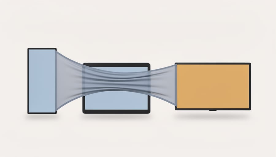
So far, you’ve been styling with fixed sizes like `width: 800px`. That works on a big monitor, but it can push content off the edge of a phone. Flexible units fix this by letting sizes adjust to the space available.
Here are the ones you’ll use most:
– Percentages (%) size something relative to its parent. A `width: 50%` box takes up half the space of whatever contains it.
– rem is relative to the root font size, which is usually 16px in browsers. So `1.5rem` is about 24px, and it scales if a visitor changes their default text size.
– em is relative to the font size of the current element, which is handy for padding that grows with the text.
– Viewport units (vw and vh) are relative to the screen itself. `50vw` is half the window’s width.
For most beginners, a good habit is rem for text and spacing, and percentages for widths.
Here’s a simple example that puts this to work:
“`css
.container {
width: 90%;
max-width: 1000px;
margin: 0 auto;
}
img {
max-width: 100%;
height: auto;
}
“`
The container takes up 90% of the screen on a phone, but stops growing at 1000px on a wide monitor. The `margin: 0 auto` line centers it. The image rule keeps pictures from spilling past their container, and `height: auto` stops them from looking stretched.
Try resizing your browser window and watch it adapt.
Step 5: Create a Simple Flexible Layout with Flexbox
Flexbox sounds fancy, but it’s really just a way to tell a group of items, “line up in a row and share the space nicely.” You only need two parts: a container and the items inside it.
Say your HTML has a wrapper with three cards inside:
“`html
“`
Now add this CSS:
“`css
.cards {
display: flex;
flex-wrap: wrap;
gap: 1rem;
}
.card {
flex: 1 1 200px;
}
“`
Here’s what each line does:
– display: flex turns the container into a flex container, so the cards sit side by side instead of stacking.
– flex-wrap: wrap lets cards drop onto a new line when there isn’t enough room, which is exactly what you want on a small phone screen.
– gap adds even space between the cards, with no fiddly margins.
– flex: 1 1 200px means “each card can grow, can shrink, and would like to be about 200px wide.”
Try it, then drag your browser window narrower. The cards rearrange themselves without any extra code. That’s the magic of flexible layouts.
Don’t worry if it feels like a lot at first. Change one value at a time, like the gap or the 200px, and watch what happens.
Flexbox is great for rows or columns of items. Later, you can explore CSS Grid, which handles rows and columns together for bigger page layouts. For now, Flexbox is plenty.
Step 6: Make It Respond with a Media Query
A media query is just an “if” statement for your stylesheet. It says, “If the screen is at least this wide, apply these extra styles.” Everything outside the query works on every screen, and the rules inside it only kick in when the condition is met.
That’s why a mobile-first approach works so nicely as a default. You write your basic styles for small screens first, then add media queries that adjust things as the screen gets wider. Phones get a simple stacked layout, and you only add complexity when there’s room for it.
Here’s a tiny example. Say you have two boxes inside a container:
“`css
.container {
display: flex;
flex-direction: column;
gap: 1rem;
}
.box {
padding: 1rem;
background: #eef;
}
@media (min-width: 40rem) {
.container {
flex-direction: row;
}
.box {
flex: 1;
}
}
“`
On a narrow screen, `flex-direction: column` stacks the boxes on top of each other. Once the screen is at least 40rem wide (about 640 pixels with default text size), the query switches them to a row, so they sit side by side and share the space equally.
Using rem for the breakpoint keeps it flexible if someone has bigger text settings. Try changing 40rem to another number and watch where the layout flips. One breakpoint is plenty to start with, so add more only when your content actually looks cramped.
How to Check Your Work and Where to Go Next
You’ve built something, so now let’s see how it holds up. Start with the simplest test: grab the edge of your browser window and drag it narrower and wider. Watch your layout. Do the items wrap neatly? Does any text spill off the side?
Next, open your browser’s developer tools (usually F12, or right-click and choose Inspect) and click the device toolbar icon. It lets you preview phone and tablet sizes without owning any of them. Try a few presets and check that nothing needs sideways scrolling.
Finally, run your stylesheet through the free W3C CSS Validator. It catches typos like a missing semicolon or brace, which are easy to make and frustrating to spot by eye.
Now for some practice. Style a one-page homepage for a pretend local bakery or a friend’s small shop. Use a max-width container, a Flexbox row of three service cards, and one media query that stacks them on phones. If you’d like to see how a complete business website comes together, that’s a great next read.
Ready for more? The next topics in the responsive design series dig into CSS Grid, responsive images, and mobile-first navigation. Once you’re comfortable there, you can even build a theme and put these skills to real use.
Common Questions About CSS Foundations
Do I need to learn CSS before HTML?
Nope, HTML comes first. CSS styles the structure that HTML creates, so you need a few elements on the page before there’s anything to color, space, or move around.
How long does it take to learn the basics?
Most beginners feel comfortable with selectors, the box model, and a simple layout after a few weeks of regular practice. Even twenty minutes a day adds up faster than you’d expect.
Should I use Flexbox or Grid?
Start with Flexbox for rows of items that wrap on small screens, like we did in Step 5. Grid is a great next step when you want to control rows and columns together.
Why does my page look different on my phone?
Usually it’s a missing viewport meta tag or a fixed pixel width that’s too wide for a small screen. Check your starter file first, then swap fixed sizes for flexible units.
Do you need a framework? Not at all. Writing plain CSS first helps you understand what any framework is doing behind the scenes, and for a small business site, a few well-organized rules often go a long way.
Once you’re comfortable with the basics, it’s also worth reading up on accessibility requirements so your pages work well for everyone, including people using screen readers or keyboard navigation.
Look how far you’ve come. You started by picking out a heading with a simple selector, then added color, fonts, and spacing to make it feel like your own. You learned how the box model wraps every element like a gift box, and how flexible units let your layout stretch and shrink without breaking. A few lines of Flexbox lined things up, and your first media query taught the page to rearrange itself when the screen changes.
Here’s the good news: these are the exact building blocks that responsive design is made of. Everything you’ll learn next sits on top of them, so the time you’ve spent here is never wasted.
The best way to make it stick is to practice. Tweak a value, refresh the page, and see what happens. Mistakes are part of the fun. When you’re ready, take your new skills into the next tutorial in the series and keep building. You’ve got this!