
Design your online gambling platform with trust-building elements front and center—prominent licensing badges, SSL certificates, and transparent terms of service should appear above the fold. Users need instant reassurance they’re on a legitimate site, so position regulatory information and security indicators where visitors see them within three seconds of landing.
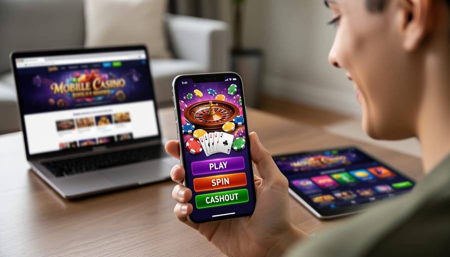
Create a streamlined navigation system that gets players to games in two clicks maximum. Unlike standard e-commerce sites, gambling platforms like zeroum um bet need lightning-fast access to game categories, account balances, and deposit buttons to minimize friction between arrival and gameplay.
Implement responsive website design technologies that work flawlessly on mobile devices, where over 60% of online gambling happens. Your CSS grid and flexbox layouts must adapt seamlessly to smaller screens, with touch-friendly buttons measuring at least 44×44 pixels and adequate spacing to prevent misclicks during betting.
Balance visual excitement with clarity by using bold colors and animations for game thumbnails while keeping functional elements like balance displays, bet amounts, and action buttons clean and unambiguous. Players make split-second financial decisions, so typography must be highly legible with sufficient contrast ratios—aim for WCAG AA standards minimum.
Build your payment interface with extreme clarity, showing real-time balance updates and making deposit limits, withdrawal timeframes, and transaction fees completely transparent. Confusion around money matters destroys user trust faster than any other design flaw in gambling platforms.
What Makes Online Gambling Websites Different
Trust and Security Come First
When people are about to hand over their credit card details or banking information, they need to feel completely safe. Your design plays a huge role in building that trust from the moment someone lands on your site.
Start with the basics: display security badges and licensing information prominently. These should go in your header or footer where visitors expect to find them. Think SSL certificates, payment processor logos, and gaming authority seals. These aren’t just decorations—they’re proof that your site follows the rules.
Use professional color schemes. Bright, flashy colors might seem fun, but they can make your site look less trustworthy. Stick with clean, sophisticated combinations that feel stable and legitimate. Blues and greens work well because people associate them with security and money.
Your payment area deserves extra attention. Make forms look secure with clear labels, proper spacing, and visible security icons. Show which payment methods you accept with recognizable logos—people trust what they know.
Remember that understanding your audience means knowing they’re cautious with real money. Include easy-to-find customer support links, clear terms and conditions, and transparent information about deposits and withdrawals. When everything is upfront and professional-looking, users feel confident moving forward.
The Fast-Action User Experience
Here’s the thing about gambling websites: every second counts. Unlike a blog where people might leisurely read an article, or an online store where customers browse casually, gambling sites need to move fast. Really fast.
Think about it from a user’s perspective. When someone places a bet on a live sports game, they need to see their balance update instantly. If they’re playing a card game, the cards need to flip smoothly without delay. Any lag or slow loading can mean the difference between catching a betting opportunity and missing it completely.
This creates some unique design challenges. Your site needs to load in under two seconds, ideally closer to one second. Compare that to regular websites where three to five seconds is considered acceptable. Why such a rush? Because gambling involves real money and real-time events. A user watching a basketball game isn’t going to wait around if your site takes forever to load their betting slip.
You’ll also need real-time updates built into your design. Odds change constantly during live events. Balances need to update the moment a bet is placed or won. This means your design must accommodate live data feeds without slowing down the entire page.
The navigation also needs to be lightning-quick. Users should reach any game or betting market in two clicks maximum. Long menu systems or complicated navigation paths will frustrate users who want to place bets quickly before odds change.
Essential Design Elements Every Gambling Site Needs
Clear Navigation That Gets Users to Games Fast
Think about the last time you visited a gambling site. You probably had a specific game in mind, right? Maybe slots, blackjack, or live roulette. The best gambling sites get you there in two clicks or less.
Start with a simple top menu that shows your main categories. Most gambling sites use these basic groups: Slots, Table Games, Live Casino, and Sports Betting. Keep these labels clear and obvious. Don’t try to be clever with names like “Spin Zone” when “Slots” works perfectly.
Your homepage should display game categories as large, clickable boxes with pictures. This visual approach helps users scan quickly and pick what they want. Add a prominent search bar at the top too, because some players know exactly which game they’re after.
Consider adding filters on category pages. Let users sort games by popularity, newest releases, or provider. This sounds fancy, but it’s actually simple to implement with basic dropdown menus.
Here’s a helpful tip: create a sticky navigation bar that stays visible as users scroll. This means they can jump to a different game category anytime without scrolling back to the top.
Remember, every extra click between your homepage and the actual games costs you potential players. Keep the path short and straightforward.
Prominent Account and Balance Information
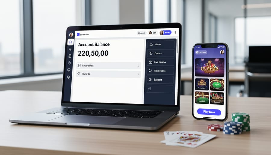
When someone logs into a gambling website, they need to see their balance right away. Think about it – you wouldn’t want to bet money without knowing how much you have available, right? That’s why gambling sites display account information more prominently than regular websites.
Your design should show three key pieces of information at all times: whether the user is logged in, their current account balance, and how to access their account settings. These elements typically live in the top-right corner of the page where users naturally look first.
The balance display needs to be large enough to read at a glance. Use clear numbers with proper currency symbols. For example, showing “$500.00” is much better than just “500” because it removes any confusion about what currency you’re using.
Login status should be obvious too. When users are logged out, show a clear “Login” button. When they’re logged in, display their username or a welcome message. This simple feedback prevents confusion and builds trust.
Make the account menu easy to find. Users should be able to check their transaction history, make deposits, or request withdrawals without hunting through complicated menus. Keep these options visible and accessible with just one or two clicks.
Responsible Gaming Features Built Into Design
Here’s the thing about responsible gaming features – they’re legally required in most places, but they don’t have to feel like a boring disclaimer page. Think of them as helpful guardrails that actually build trust with your users.
Start with a small but visible “Responsible Gaming” link in your main navigation or footer. When clicked, it should open a clean page or popup explaining available tools. Keep the language simple and supportive, never preachy.
For deposit limits, create a straightforward form in the user’s account settings. Let players set daily, weekly, or monthly limits with just a few clicks. Use clear input fields and immediate confirmation messages like “Your $100 weekly limit is now active.”
Self-exclusion tools should be easy to find but require a simple confirmation step to prevent accidental clicks. A button labeled “Take a Break” feels friendlier than harsh warnings, while still doing the job.
Here’s a smart design trick: add a small question mark icon next to your responsible gaming link. When users hover over it, show a tooltip with text like “Set limits and find support resources.” This gives information without taking up screen space.
Finally, include quick links to gambling support organizations. Display them as discrete icons or text links in your footer. Organizations like GamCare or the National Council on Problem Gambling should be just one click away.
Mobile-First Design (Because That’s Where Players Are)
Here’s the thing about gambling sites: over 70% of players access them from phones and tablets. Think about it – people want to place quick bets during their lunch break or play a few slots while waiting for the bus. Your site needs to work perfectly on small screens first, then scale up to desktops.
What does mobile-first actually mean? Start designing for a phone screen (usually around 375 pixels wide), then adapt your layout for larger screens. This keeps things simple and focused.
For gambling sites specifically, your mobile design needs super-easy touch targets. Buttons for betting should be at least 44 pixels tall so thumbs don’t accidentally hit the wrong option. Imagine someone trying to bet $10 but accidentally tapping $100 instead – that’s a terrible user experience.
Keep your navigation clean and accessible. Use a hamburger menu if needed, but make sure critical actions like “Deposit” and “My Account” are always visible. Test everything on actual phones, not just browser simulators. Load times matter even more on mobile networks, so optimize those images and simplify your code where possible.
Remember: if your gambling site doesn’t work smoothly on mobile, players will simply find one that does.
Color Psychology and Visual Design for Gambling Sites

Colors That Build Trust vs. Colors That Create Excitement
Color psychology plays a huge role in gambling website design. You want visitors to feel both confident and excited, which means finding the right balance between trustworthy and energetic colors.
Professional colors like deep blues and blacks form the foundation of most successful gambling sites. Think about it: when you’re asking people to enter their payment information, you need them to feel secure. Navy blue naturally communicates stability and reliability, while black adds sophistication and makes other elements pop. These colors should dominate your navigation bars, backgrounds, and main structural elements.
But here’s the fun part: gambling is about entertainment and excitement! This is where accent colors come in. Bright reds, vibrant golds, and electric oranges grab attention and create that thrilling casino atmosphere. Use these sparingly on call-to-action buttons like “Play Now” or “Claim Bonus,” around jackpot amounts, and for highlighting special promotions.
When you’re setting up your color scheme using CSS stylesheet types, start with your trust colors as primary and add excitement colors as accents. A good rule of thumb: 70% professional colors, 30% energetic accents.
Avoid neon colors or anything too flashy as your base. They might seem exciting, but they actually make sites look less legitimate. Similarly, don’t go all-serious with only grays and blacks, or your site will feel boring and uninviting. The sweet spot is that perfect blend where users feel safe enough to deposit money while still feeling the rush of playing.
Using Contrast to Highlight Important Actions
Think of contrast as your secret weapon for guiding players’ eyes exactly where you want them to go. When someone’s ready to place a bet or cash out their winnings, they shouldn’t have to hunt for the button. This is where smart contrast comes into play.
Start with color. Your main action buttons should use colors that pop against your background. If your site has a dark theme, bright green or orange buttons work beautifully. For lighter backgrounds, deep blues or vibrant reds catch attention instantly. Just make sure your color choice doesn’t clash with your overall design.
Size matters too, but bigger isn’t always better. Your “Place Bet” button should be noticeably larger than secondary buttons like “Cancel” or “Back,” but not so huge it looks cartoonish. Think about making it 20-30% larger than other buttons on the screen.
Here’s a simple trick: add a subtle shadow or glow effect to your primary buttons. This creates depth and makes them appear clickable. You can do this with basic CSS using the box-shadow property. Even a small 2-3 pixel shadow makes a difference.
White space is your friend. Give your important buttons room to breathe by adding padding around them. When buttons are cramped next to other elements, they lose their impact. A clear border of empty space draws the eye naturally.
Remember, you want contrast that guides without shouting. Test your buttons by squinting at your screen. The important actions should still stand out even when everything’s slightly blurry.
Building the Core Pages: HTML and CSS Basics
Creating a Clean Homepage Layout
Let’s build a homepage that grabs attention and makes navigation easy for your visitors. A gambling website homepage needs to balance excitement with simplicity, so players can quickly find what they’re looking for.
Start with a basic HTML structure that includes a header, hero section, game showcase area, promotions section, and footer. Your header should contain your logo and main navigation menu with links to Games, Promotions, About, and Login/Register buttons.
The hero section sits right at the top and is your first impression. Keep it clean with a compelling headline like “Your Premier Gaming Destination” and a single call-to-action button. Don’t clutter this space with too many messages.
For your game showcase, create a grid layout using CSS. This displays your popular games in neat rows and columns. Use simple CSS like display: grid with grid-template-columns: repeat(auto-fit, minmax(250px, 1fr)) to make your game tiles automatically adjust to different screen sizes. Each game card should show a thumbnail image, game name, and category tag.
The promotions section works similarly but typically features larger banners. Use eye-catching images but avoid making them too flashy or distracting. Remember, you want players to understand the offer at a glance.
For spacing and readability, use CSS padding and margin properties generously. White space is your friend. It prevents your homepage from looking overwhelming. Keep your color scheme consistent throughout, using two or three main colors that complement each other.
Designing a Game Listing Page
Creating an attractive game listing page is easier than you might think! Start with a simple grid layout using CSS Grid or Flexbox. These tools help you arrange game thumbnails in neat rows and columns that automatically adjust to different screen sizes.
For each game, include a thumbnail image, the game name, and maybe a quick label like “Popular” or “New.” Keep your images the same size so everything looks tidy. A good starting point is creating boxes around 200×200 pixels.
Next, add filters at the top of your page. Think categories like “Slots,” “Card Games,” or “Live Dealer.” You can create these as simple buttons using HTML and CSS. When someone clicks a filter, you’ll use JavaScript to show only matching games.
Here’s a quick tip: add hover effects to your game thumbnails. When someone moves their mouse over a game, make it slightly larger or add a colored border. This small touch makes your site feel more interactive and professional.
Remember to leave enough white space between games so the page doesn’t look crowded. Your visitors should be able to browse comfortably without feeling overwhelmed by too many options at once.
Building User Account Sections
User accounts are the backbone of any gambling site, so let’s keep them simple and secure. Start with your login form – you only need two fields: username or email, and password. Add a “Remember Me” checkbox and a “Forgot Password?” link underneath. Keep the form centered on the page with plenty of white space around it.
For registration pages, ask for the essentials only: email, username, password, and date of birth (since age verification is legally required for gambling sites). You can always collect more details later. Use clear labels above each field and show a small checkmark when someone fills it out correctly. Add a simple progress indicator if you split registration into steps.
Your account dashboard should display the most important information first: current balance, recent bets, and quick deposit buttons. Think of it like a bank app – users want to see their money and take action fast. Create a simple sidebar menu with links to deposits, withdrawals, betting history, and account settings.
Use consistent colors and button styles across all these pages. Green buttons for positive actions like “Login” or “Deposit,” and keep everything else neutral. Test your forms on your phone too – many users will access them on mobile devices.
Performance and Speed Considerations
Optimizing Images Without Losing Visual Appeal
Your gambling site’s images can make or break the user experience. Large image files slow down your site, but you don’t want blurry game thumbnails either. The good news? You can have both fast loading and great visuals.
Start by choosing the right format. Use WebP instead of PNG or JPEG when possible – it’s significantly smaller while looking just as good. Most modern browsers support it now. For game thumbnails, aim for files under 50KB each.
Before uploading any image, run it through a free compression tool like TinyPNG or Squoosh. These tools can reduce file sizes by 60-80% without visible quality loss. You’ll be amazed at the difference.
Set specific dimensions for your images in your code. If a thumbnail displays at 200×200 pixels on screen, don’t upload a 1000×1000 pixel version. Create it at the exact size you need, or just slightly larger for high-resolution screens.
Consider lazy loading for images below the fold. This means images only load when users scroll down to see them, making your initial page load lightning fast. It’s a simple addition to your code that makes a huge difference for site performance.
Keeping Your Code Clean and Minimal
Gambling sites need to load fast because players want instant action. Every extra line of code slows things down, and slow sites lose visitors quickly. Think of your code like a deck of cards – you only want what you need, nothing extra.
Start by cleaning up your code regularly. Remove unused CSS styles and unnecessary div tags. Each element should have a clear purpose. If you’re copying code from different sources, you’ll often end up with duplicate styles that make your file bigger than needed.
Keep your CSS file separate from your HTML. This makes updates easier and helps browsers load your site faster. Use shorthand CSS properties when possible – instead of writing four lines for margins, write one.
Avoid adding fancy plugins or features just because they look cool. Every addition should serve your players. A clean, minimal site that loads in two seconds beats a bloated one that takes ten seconds every time.
Common Design Mistakes to Avoid
Too Much Information on One Screen
It’s tempting to showcase everything your gambling site offers right on the homepage – games, promotions, bonuses, login forms, registration buttons, news updates, and more. But here’s the thing: when visitors land on a page overflowing with information, they often feel overwhelmed and leave.
Think of your homepage like a storefront window. You want to display your best items, not your entire inventory. Too much clutter makes it hard for people to focus on what matters most.
Start by identifying your top three priorities. For most gambling sites, these might be: getting users to sign up, showcasing popular games, and highlighting current promotions. Everything else can wait or move to other pages.
Use white space generously. This is the empty area around your content, and it gives visitors’ eyes a place to rest. Group related items together and use clear sections to organize information.
Instead of cramming ten promotional banners on one screen, feature your strongest offer prominently and link to a dedicated promotions page for the rest. Create a simple navigation menu that helps users find specific game categories, payment info, or support when they need it.
Remember, you can always guide visitors deeper into your site through well-placed buttons and links. Your homepage’s job is to welcome them and point them in the right direction, not tell them everything at once.
Making the Betting Process Complicated
Every extra click between a visitor discovering your site and actually placing a bet is a chance for them to change their mind and leave. Unfortunately, many gambling sites create unnecessary hurdles that frustrate users.
Think about it from a player’s perspective. They see an exciting game, click to play, and then face a maze of steps: multiple registration screens, email verification requirements, mandatory profile completions, and confusing payment forms. By the time they reach the actual game, they’ve lost interest.
The problem often starts with non-compliant HTML code that creates broken forms or slow-loading pages. But it’s also a design issue. Some sites require users to navigate through five or six pages just to make a simple deposit.
Keep your betting process streamlined. Allow guest browsing of games before registration. Make sign-up forms short and sweet, asking only for essential information upfront. Enable one-click deposits for returning users. Each unnecessary step you remove increases the chance that visitors will actually become active players. Remember, simplicity wins every time.
You’ve made it through the essential principles of online gambling website design, and that’s something to celebrate! Even if you’re just starting your web development journey, you now understand what makes these sites work effectively.
Remember, you don’t need to be an expert programmer to apply these concepts. Start small. Focus on building a clean homepage first. Make sure your buttons are easy to find. Test your site’s loading speed using free online tools. Ask a friend to navigate your site and watch where they get confused.
The three pillars to keep in mind are trust, speed, and clarity. Your visitors need to feel safe sharing their information, so include those trust signals like security badges and clear contact details. They want fast loading times because nobody enjoys waiting, especially when money is involved. And above all, they need to understand exactly what they’re doing at every step.
Don’t get overwhelmed by trying to implement everything at once. Pick one element from this guide, work on it until you’re comfortable, then move to the next. Maybe start with improving your color scheme, then work on your navigation menu, then optimize your images for faster loading.
The gambling website industry has specific requirements, but you’re now equipped with the knowledge to meet them. Keep learning, keep testing, and most importantly, keep your users’ experience at the center of every design decision you make. You’ve got this!