

Making a concept web for your website means sketching out every page, section, and piece of content in a visual diagram before you write a single line of code. This planning step takes 30 to 90 minutes depending on your site’s complexity, and it saves you hours of confusion and rework later. You’ll connect circles or boxes representing each page with lines that show how visitors move through your site, creating a bird’s-eye view of your entire web structure.
Think of it as a blueprint for a house. You wouldn’t start hammering nails without knowing where the kitchen goes, right? A concept web does the same job for your website. It shows you if your navigation makes sense, whether visitors can find what they need in two clicks instead of six, and where you might be creating dead ends that trap people with no clear next step.
This guide walks you through the entire process, from grabbing a pencil and paper (yes, really) to checking your finished web for common pitfalls. You don’t need design software or technical knowledge. If you can draw circles and lines, you can create a concept web that transforms a jumbled pile of ideas into a clear path forward. By the end, you’ll have a tested map ready to guide your actual website build.
What You’ll Need to Create Your Concept Web
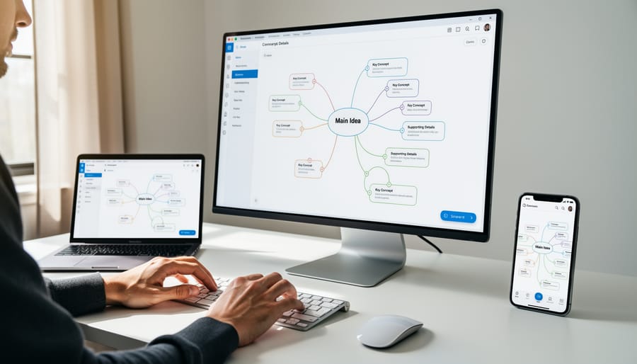
You don’t need fancy software or design experience to create a concept web. In fact, many successful web designers start with whatever’s handy, a napkin, a whiteboard, or a free online tool. The beauty of concept webs is their simplicity.
Here’s what you’ll need:
- Paper, whiteboard, or a blank wall space where you can sketch freely
- Digital drawing tool such as (completely free), Figma’s free tier, or even Google Slides
- Colored markers, pens, or highlighters to distinguish different sections
- Sticky notes for easy rearrangement (optional but helpful)
- A rough list of your website’s planned content and pages
If you’re going analog, grab a large sheet of paper or use a whiteboard. The extra space helps you spread out ideas without feeling cramped. Regular printer paper works, but bigger is better, you want room to add connections and notes as your thinking evolves.
For digital options, is perfect for beginners because it’s free, runs in your browser, and saves automatically. Figma’s free version offers collaborative features if you’re working with a partner or client. Even basic tools like PowerPoint or Keynote work fine, you’re just drawing circles and lines, not designing artwork.
Colors matter more than you’d think. Use them to group related pages, distinguish content types from functional elements, or mark priority levels. Three to five colors is plenty; more can get confusing.
The most important tool? Your content list. Before you start drawing, jot down every page, section, and feature you think your website needs. This gives you material to organize visually rather than staring at a blank page wondering where to begin.
Before You Begin: Important Considerations
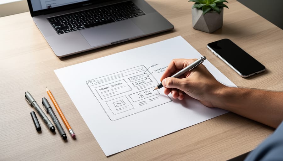
Before you dive into drawing boxes and lines, take a moment to gather your materials, and your thoughts. The biggest mistake beginners make is treating a concept web like a rushed sketch they can fix later. You can’t build a solid website structure if you haven’t figured out what content you actually have or what your visitors need to find.
Start by collecting all your content ideas in one place. Write down every page, feature, and piece of information you think your site needs. Don’t organize yet, just brain-dump. If you skip this research phase and jump straight to mapping, you’ll end up with a concept web full of gaps and question marks. You need the raw material before you can organize it.
Another common pitfall is overcomplicating things too early. Your concept web should show the big picture, main pages, major sections, how they connect. If you’re labeling every button, form field, and image placement, you’ve gone too far. Save those details for wireframes. Right now, you’re mapping the forest, not counting individual leaves.
Finally, resist the urge to make it perfect on the first try. Your concept web will need revisions as you spot redundancies or realize two sections should merge. That’s normal and healthy. In fact, tree testing for navigation often reveals structural issues that looked fine on paper, so expect to adjust your web as you learn more about how real users think.
Step-by-Step: Building Your Website Concept Web
Start with Your Central Idea
Think of your central idea as the bullseye of your concept web. This is the single, clearest statement of what your website exists to do.
Grab your paper or open your digital tool. In the middle of the page, write one sentence that captures your site’s main purpose. Not what you want to include, but what you want to accomplish.
For a small business, your central idea might be “Local bakery showcasing custom cakes and taking orders.” For a portfolio, try “Freelance photographer displaying commercial and wedding work.” An informational site could use “Guide to urban gardening for apartment dwellers.”
Keep it simple and specific. Avoid vague phrases like “my business website” or “stuff I like.” Your central idea should tell anyone who reads it exactly what a visitor will find and why they’d come to your site.
If you can’t fit your purpose into one clear sentence, you might be trying to do too much. Narrow it down. Everything else in your concept web will branch from this center point.
Map Your Main Pages and Sections
With your central idea sitting in the middle of your page, it’s time to add the main branches. These represent your primary navigation, the big buttons or links visitors will see in your menu bar.
Start with the essentials most websites need: Home, About, and Contact. Then think about what makes your site unique. A photographer needs a Portfolio section. A consultant wants Services. A blogger requires a Blog or Articles page.
Ask yourself: “What are the 4-7 things someone visiting my site most needs to find?” That number keeps navigation manageable. Too many top-level pages overwhelm visitors and make your concept web cluttered.
Draw thick lines from your center circle to each main page, spacing them evenly around it. Write each page name clearly. For a bakery website, you might have: Home, Menu, Order Online, Our Story, Catering, and Contact.
Don’t worry about perfect choices yet. You can always move or merge sections later. Right now, you’re capturing the skeleton of your site, the main rooms of your digital house before you arrange the furniture inside them.
Add Sub-Pages and Content Elements
Now that you have your main pages radiating from the center, it’s time to add the smaller pieces that live inside them. Think of this step as opening up each main branch to reveal what’s actually in there.
Start with one main page, let’s say “Services”, and ask yourself what specific things belong under it. If you’re a photographer, that might be “Wedding Photography,” “Portrait Sessions,” and “Event Coverage.” Draw these as smaller branches coming off the Services branch. Don’t worry about getting every detail, focus on the major content chunks a visitor would look for.
Do this for each main section. Under “About,” you might add “Our Story,” “Team Members,” and “Testimonials.” Under “Contact,” perhaps “Contact Form,” “Office Location,” and “Hours.”
You’ll notice some sections need more sub-branches than others, and that’s completely normal. Your homepage might stay simple while Services becomes busier. Let the content determine the complexity, don’t force every branch to match.
If you’re using paper, keep your sub-branches shorter than the main ones so the hierarchy stays visually clear. On digital tools, use smaller text or thinner lines for these secondary elements.
Connect Related Ideas with Lines
Once you’ve mapped out your pages and content, it’s time to draw lines between related elements. This step reveals how visitors will move through your site.
Draw a line whenever two items should link to each other. For example, connect your “Services” page to your “Contact” page, people who browse your offerings often want to reach out. Link your blog posts to relevant service pages. Connect your portfolio items to your “About” page so visitors can learn more about you.
These connections aren’t just visual, they’re your future navigation strategy. Every line you draw represents a potential hyperlink on your actual website. If you find an element with no connections, ask yourself why it exists. Isolated pages confuse visitors.
Use different line styles to show relationship types. Solid lines might represent main navigation links. Dotted lines could show secondary connections or suggested reading. Arrows indicate one-way relationships, like a blog post linking to a product but not vice versa.
Don’t overthink it. Draw the connections that feel natural. Your concept web should start looking like a web now, not a starburst.
Use Colors and Symbols to Organize
Once you’ve drawn your basic structure, visual coding makes your concept web instantly more useful. Think of colors and symbols as your personal filing system, they help you spot patterns and remember decisions weeks later when you’re actually building the site.
Try assigning colors by purpose. For example, use blue for all public-facing pages, green for admin or backend features, and yellow for content that needs writing. If you’re working on paper, colored markers work great. Digital tools let you fill shapes with different colors easily.
Shapes matter too. Rectangles can represent actual pages, circles for features or functions (like “search box” or “contact form”), and diamonds for content blocks you haven’t finalized yet. Stick with simple shapes so your web doesn’t get cluttered.
Add quick annotations for technical reminders. A star might mean “needs database,” a dollar sign for “paid feature only,” or “WP” to flag something you’ll build with a specific platform.
Your color scheme doesn’t need to be fancy. Even just two or three colors will transform a tangled mess into something you can scan and understand in seconds.
Review and Simplify Your Web
After mapping all your ideas, take a break, even five minutes helps. Then look at your concept web with fresh eyes. Ask yourself: Could a visitor reach any page in three clicks or fewer? If not, your structure might be too deep.
Look for duplicate branches. If “Services” and “What We Do” both appear, merge them. Remove orphaned elements that don’t connect to anything, they’re either unnecessary or belong elsewhere.
Circle your most important pages. Do they stand out visually, or are they buried among less critical content? Your concept web should reflect priorities, not just list everything equally.
Finally, trace a few user journeys from the center outward. Can someone logically move from “Home” to “Contact” without confusion? If your paths feel tangled, simplify the connections before moving forward.
Checking Your Work: Does Your Concept Web Make Sense?
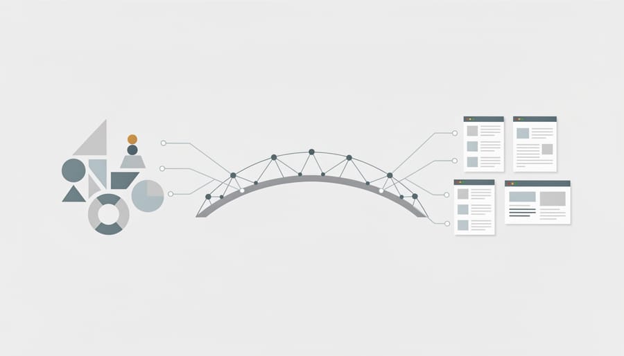
You’ve built your concept web, but how do you know it’ll actually work when you start designing? A good concept web should communicate your site’s structure clearly to anyone who looks at it, including your future self two weeks from now. Testing it now saves you from rebuilding pages later.
Start with the stranger test. Show your concept web to someone who isn’t familiar with your project, a friend, family member, or colleague. Can they understand what your website is about just by looking at it? If they’re confused about how pieces connect or what a section means, your web needs clarification. Add labels, simplify connections, or reorganize branches until the logic is obvious.
Next, run through this quick verification checklist:
- Can you trace a path from any element back to the center concept?
- Does every main branch represent a clear, distinct purpose?
- Would a first-time visitor understand how to move through this structure?
- Are there any orphaned or disconnected elements floating without connections?
Every element should tie back to your central purpose. If you find a page or feature that doesn’t connect naturally, either draw a clear relationship or remove it. Disconnected elements usually indicate scope creep, ideas that sounded good but don’t serve your site’s core goal.
Finally, compare your web against your original goals. If you started wanting a simple portfolio to showcase five projects, but your concept web now includes a blog, shop, and membership area, you’ve drifted. It’s fine to expand scope, but do it intentionally. Your concept web should reflect what you actually need to build, not every possible feature you might add someday.
What to Do Next: From Concept Web to Website
You’ve finished your concept web, now it’s time to turn those interconnected ideas into an actual website. Think of your concept web as the blueprint; this next phase is where you start building the house.
First, use your concept web to create wireframes for each main page. Wireframes are simple sketches showing where content blocks, images, and buttons go on a page. Your concept web already tells you what belongs on each page, just arrange those elements on a rectangular canvas representing your browser window. Sketch these by hand or use free tools like Figma or Excalidraw. Don’t worry about colors or fancy design yet. Boxes and labels work perfectly.
Next, translate your web’s hierarchy into an HTML structure plan. The central concept becomes your homepage. Main branches become primary navigation links in your header menu. Sub-branches might become dropdown menu items or secondary pages linked from parent pages. Write down which pages need to exist and how they’ll link to each other. This list becomes your site’s navigation architecture.
Now plan your navigation menu. Look at your concept web: which 4-6 main branches are most important? Those become your top navigation items. Group related sub-branches under them. If you’ve got 10 main branches, you’ve probably gone too detailed, combine similar topics.
Finally, start sketching individual page layouts. Pick your homepage first. Based on your concept web, what content needs to appear? In what order? Sketch a simple layout showing header, hero section, main content areas, and footer.
Your concept web just transformed from abstract planning into concrete design decisions. That’s exactly how professionals work, big picture first, details second.
Common Questions About Concept Webs for Web Design
So you’ve drawn your concept web and you’re wondering if you did it right. These questions come up constantly for beginners, and the answers might surprise you, there’s more flexibility than you think.
How detailed should my concept web be?
Keep it high-level at first, focus on main pages and major content sections, not every paragraph or button. You can always add detail later if needed, but starting simple prevents overwhelm and keeps your structure clear.
Can I change my concept web after I start building the site?
Absolutely. Your concept web is a planning tool, not a contract. As you build and test, you’ll discover what works and what doesn’t, just update your web to reflect those insights.
My website is really simple, just three pages. Do I still need a concept web?
Even simple sites benefit from a quick sketch. It takes five minutes and helps you see how those three pages connect, what content goes where, and whether you’re missing anything obvious.
What’s the difference between a concept web and a sitemap?
A sitemap is a formal, hierarchical diagram showing exact page relationships and URLs. A concept web is looser and more creative, it captures ideas, features, and connections before you’ve committed to a rigid structure.
The truth is, professional designers do use concept webs, though they might call them mind maps, brainstorm diagrams, or just sketches. The format matters less than the thinking it forces you to do. When you map ideas visually before diving into code, you catch structural problems early, like realizing your Services page actually needs to be three separate pages, or that your About section doesn’t connect logically to anything else.
Create your concept web right after you’ve gathered your content ideas but before you open your code editor or website builder. That’s the sweet spot. You know what you want to say, but you haven’t locked yourself into a structure yet.
Creating a concept web before you start building your website is one of the smartest 30 minutes you’ll invest in your project. You don’t need fancy software or design training. A simple sketch on paper can save you hours of rework and prevent the frustration of realizing halfway through coding that your navigation doesn’t make sense.
Your concept web doesn’t have to be perfect. Even a rough diagram with circles and connecting lines gives you clarity about what goes where and how everything fits together. It’s much easier to erase a line on paper than to restructure an entire website after you’ve already built it.
The best part? You can start right now. Grab a blank sheet of paper or open a free tool like, write your website’s main purpose in the center, and begin branching out. Give yourself permission to make a messy first draft. You’ll refine it as you go, and by the time you’re ready to code, you’ll have a clear roadmap that makes the entire build process smoother and faster.